
Our relationship with color is deeply personal and surprisingly complex. It’s shaped by emotion, memory, cultural context, and even trend cycles. The colors we choose for our homes are rarely just aesthetic decisions; they’re declarations of how we want to feel in the spaces that hold us.
When I first began designing our entryway, I imagined a space that was impressionable. I wanted something bold, but still harmonious with the light, airy feel of the rest of our home.
The safe choice would’ve been simple: keep the console a neutral tone, and let color appear through easy-to-swap accessories. But instead, I landed on a warm hue that felt rich, grounded, and just expressive enough to add depth without overwhelming the space.
Now, the space holds presence. A visual welcome that says: something intentional lives here.
Color as Emotional Architecture
Color in a space is a form of emotional architecture. Invisible, but shaping how we feel as much as any floor plan or finish. When considering colors for your home, start by asking what feels good. What emotion do you want the space to hold?
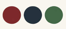
Rich, deep hues like burgundy, navy, or forest green can create feelings of intimacy, security, and embrace
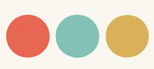
Bright, clear colors like coral, turquoise, or sunny yellow often evoke energy, optimism, and alertness
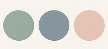
Soft, muted tones like sage green, dusty blue, or blush tend to generate calm, reflection, and quiet
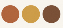
Earth tones like terracotta, ochre, or warm brown typically ground us, connecting to stability and nature
Monochromes in shades of gray, white, or black create sophistication, focus, and clarity
Color shifts perception. It affects energy levels, moods, how large or small a space feels. Your space changes when the color does—even if nothing else moves.
Finding Courage in Color Selection
If you’ve felt drawn to bold, expressive color but hesitated to commit, you’re not alone. Here are a few ways I’ve learned to build confidence in my choices:
Start with Color Theory, End with Intuition
Understanding basic color theory provides a helpful foundation. Knowing the basics (like complementary or analogous colors) can help, but your emotional reaction to a shade matters most. Choose colors that make you feel the way you want to feel.
→ Try layering hues from the same family—like navy with soft blue-grays—for subtle drama.
Let Function Guide Emotion
Each room serves a different purpose. Let the color amplify that intention. A workspace might benefit from colors that enhance focus and energy. A bedroom might call for tones that promote rest.
→ Energizing spaces like kitchens or offices? Think mustard yellow or terracotta.
→ Spaces for rest like bedrooms? Indigo, sage, or soft pastel tones work beautifully.
Test Before Committing – Always Test in Real Light
Paint behaves differently depending on the time of day and direction of natural light. We tested several colors before finding one with just the right undertone for our entryway.
→ Tip: Always sample near your floors or furniture to see how the color interacts.
Remember It’s Just Paint
Truly, of all the design choices you can make, paint is among the most reversible. This perspective can free you to take risks, knowing that if a color choice doesn’t work as expected, it can be changed without major investment.
Remember, the colors that surround you daily should speak to your heart, not ones that play it safe or are too bold, they feel out of character or bring a feeling of “noise,” not peace.
0 Comments