
Every few months, the internet decides what color belongs in our homes.
Beige is out. Color is in. Then suddenly… beige is back again.
But the reality is — colors have always been about psychology. The way you respond to color has less to do with style, and more to do with what your mind needs. The hues you live with are emotional choices that should quietly reflect what your mind needs: calm, focus, warmth, or energy.
If you’ve ever wondered what colors are right for your home or felt pressured by trends, this guide will help you use color psychology to create a space that supports your mental well-being.
Step 1: Understanding How Color Psychology Actually Works
Color psychology isn’t one-size-fits-all.
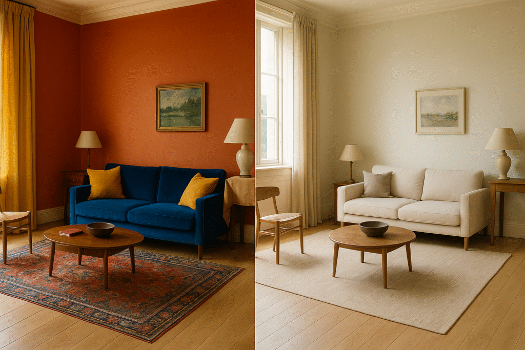
Yes, blue can be calming. But a bright, saturated blue in a room with harsh lighting might feel cold and unwelcoming. Context matters—light, texture, and your personal associations all play a role.
Instead of considering what’s in style, ask: How does this color make me feel in this space?
Muted, desaturated colors naturally reduce sensory input. They’re easier for your brain to process, which is why they feel restful.
Saturated, bold colors demand attention. They can energize, but they can also exhaust if you’re already overstimulated.
Warm undertones (cream, clay, terracotta) create psychological warmth—they literally make spaces feel more inviting.
Cool undertones (sage, soft gray-blue) can feel calming, but without warmth, they could feel distant.
Contrast and Clarity
Your brain craves just enough contrast to function well:
- Too little contrast (all one tone) can feel flat and unmotivating
- Too much contrast (stark black and white) can feel jarring and stressful
- Gentle contrast (ivory + sage, cream + soft clay) provides clarity without overwhelm
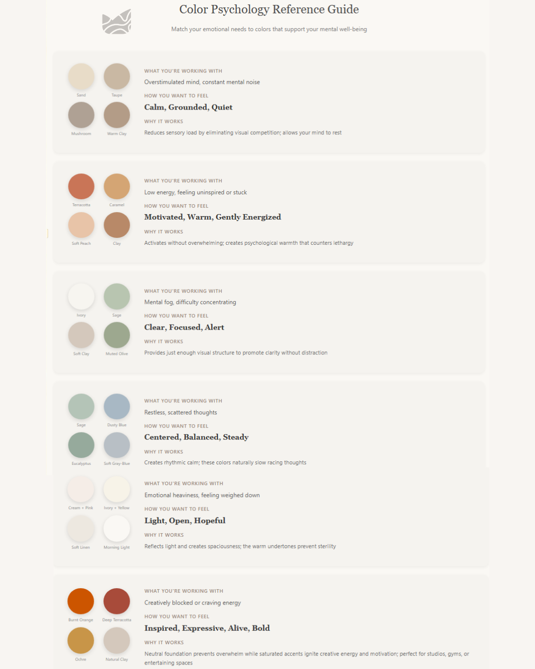
Step 2: Identify Your Emotional Needs
Before you pick a color, pause and ask:
“How do I want to feel in this space?”
Maybe you come home overstimulated from a busy day and need your space to quiet the noise. Or perhaps your mornings feel sluggish and you need a gentle nudge of energy. Your home should work for you—not against you.
Here’s how to match your emotional needs to colors that actually support them:
Step 3: Applying This to Your Space
Now that you know what you’re working with emotionally and understand how colors function psychologically, here’s how to actually choose:
Start with Your Primary Need
Think about the room’s main purpose and your dominant feeling when you’re in it.
For spaces that need calm:
- Bedroom = I need to decompress and rest → Muted neutrals with warm undertones
- Home office = I need focus without feeling sterile → Gentle contrast with natural light
- Living room = I need calm but don’t want it to feel lifeless → Layered warm neutrals with texture
For spaces that crave energy:
- Home gym = I need motivation and physical energy → Rich terracotta or burnt orange accent wall with neutral base; this activates your body without overwhelming your senses mid-workout
- Creative studio = I need inspiration and bold expression → Deep ochre, burgundy or saturated clay as a feature color; pair with plenty of natural materials to ground the energy
- Dining/hosting area = I want warmth and lively conversation → Warm terracotta tones or caramel accents; these colors psychologically “gather” people and create intimacy without being aggressive
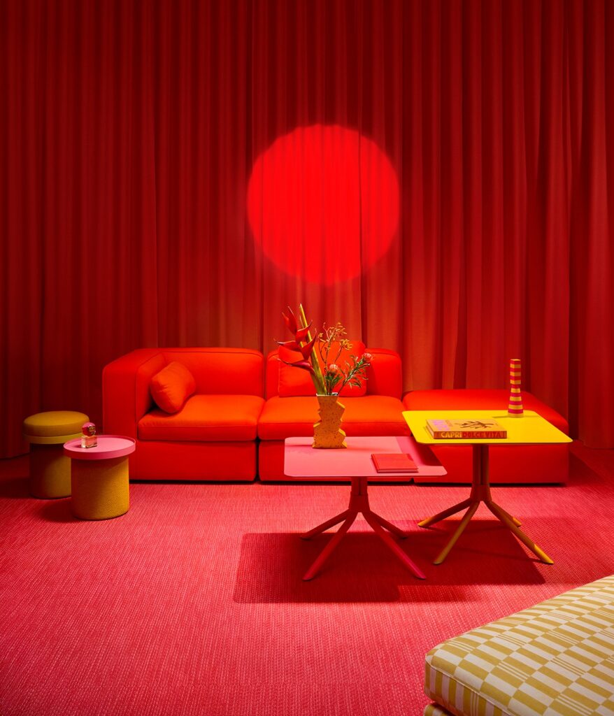
The key difference: In high-energy spaces, you’re not living in them for 8+ hours a day. You enter with intention, use the space actively, then leave. This means you can handle and actually benefit from more saturated, energizing colors.
Layer in Texture and Material
Color alone won’t do the work—this is where many people get stuck. Your overstimulated mind that needs muted tones? It still needs something to engage with, just in a gentler way.
Instead of visual stimulation through bold color, try:
- Natural wood grain
- Woven textiles (linen, cotton, jute)
- Organic shapes in pottery and vessels
- Subtle variations in tone (sand + taupe + mushroom)
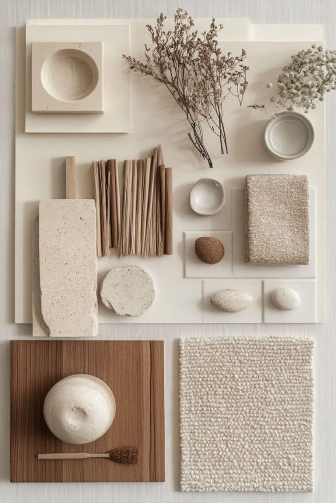
This is how you create beauty without noise.
When you choose based on how you want to feel rather than what you want to look like, you create spaces that actually serve you. Spaces that support your mental well-being instead of adding to the noise.
Your home isn’t an Instagram feed. It’s where you live, rest, and restore. Choose colors that honor that.
0 Comments